Mobile and tablet views
Check and adjust how your pages look on phones and tablets.
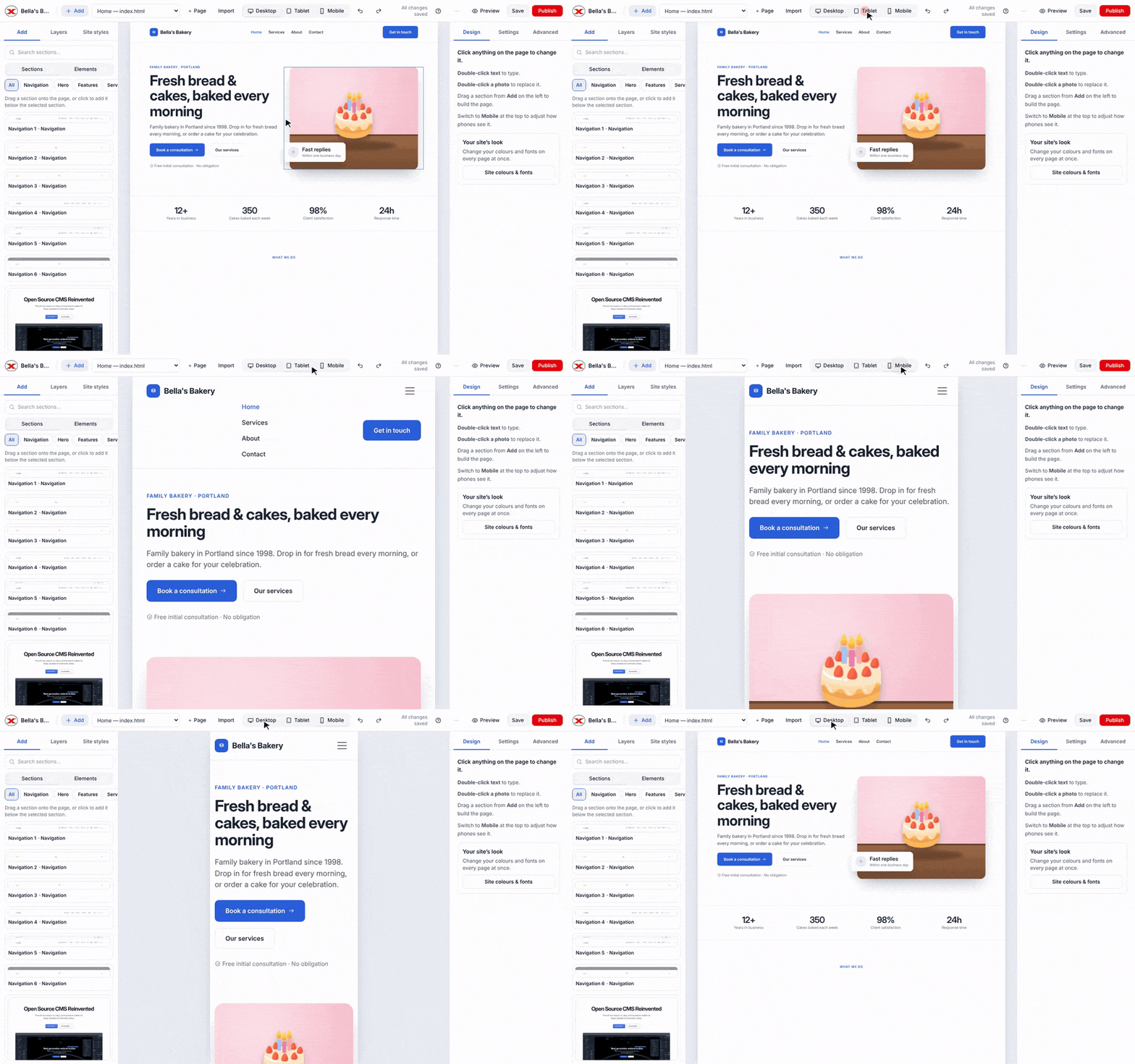
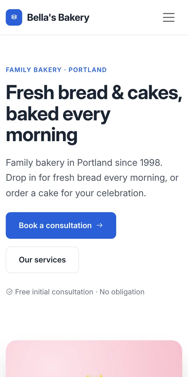
Use Desktop, Tablet and Mobile in the middle of the editor toolbar. The page is shown at that screen width, just as a visitor's device would show it.
Fixing things on mobile
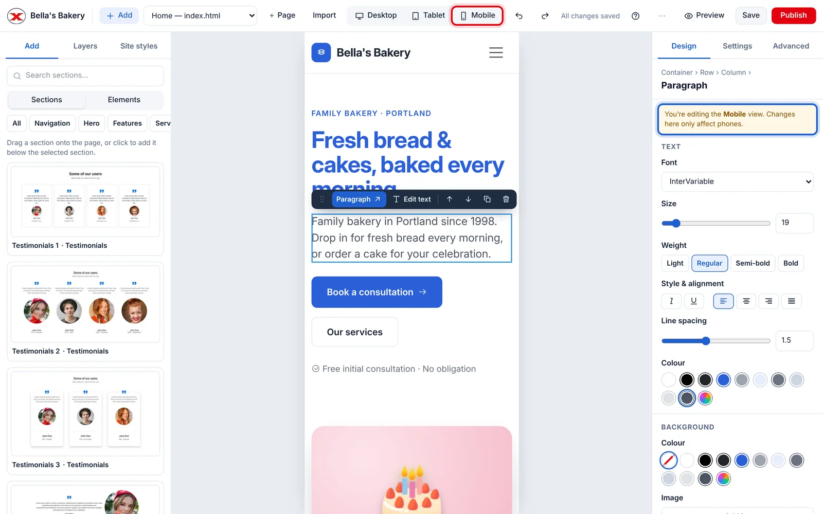
Most templates already adapt to small screens. If something looks wrong on a phone:
- Click Mobile.
- Select the item that looks wrong.
- Change it in Design, for example a smaller text size or less spacing. The panel reminds you that you're changing the Mobile view.
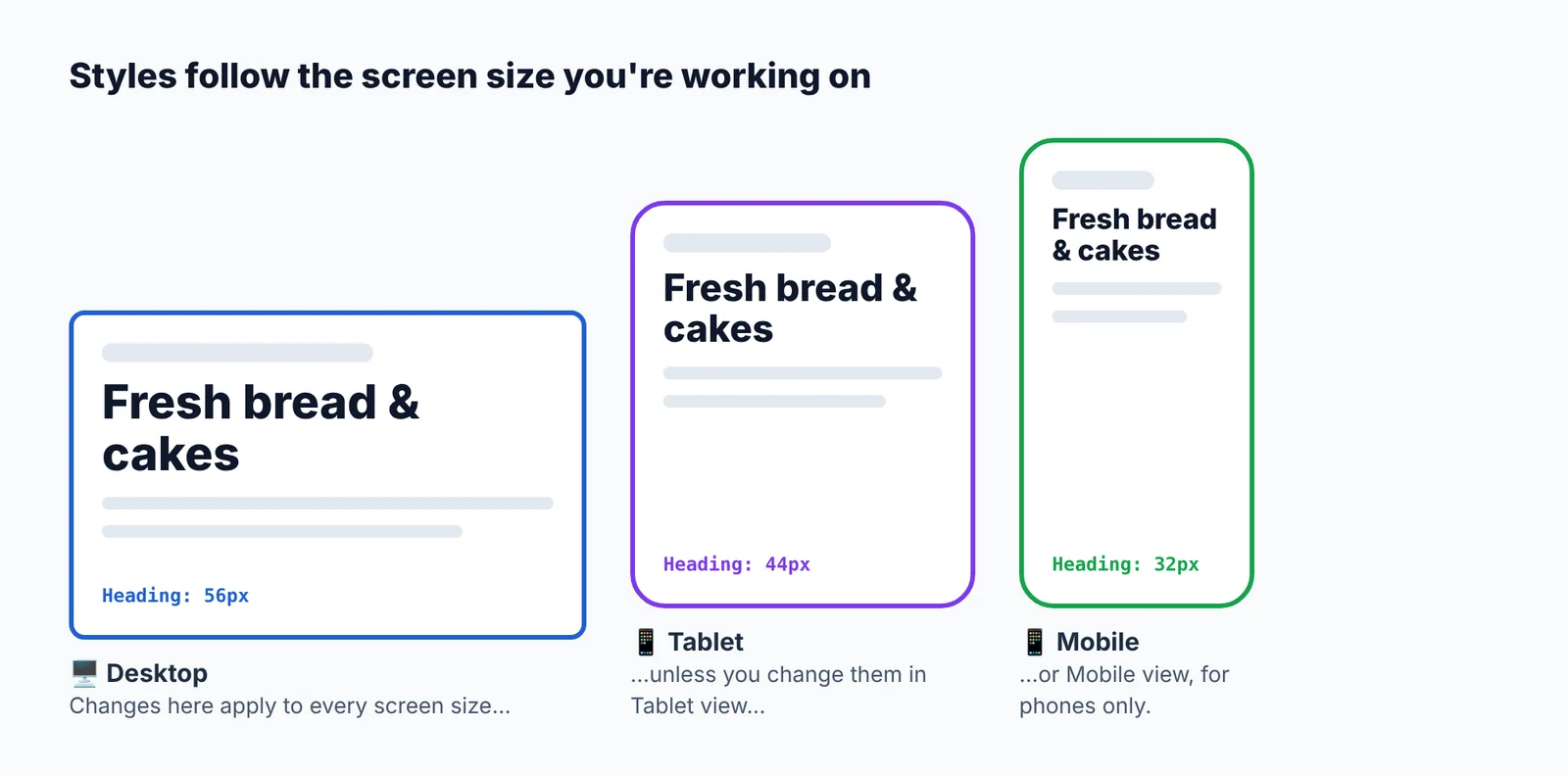
Changes made in Mobile view only apply to phones; the desktop design isn't affected. The same goes for Tablet.
Hiding something on phones
Click Mobile, select the item, and tick Hide on phones under Design → Visibility. It stays visible on bigger screens. Hidden items can still be found, and selected, in Layers.
Checking on a real phone
Publish, then open your site on your phone:
Updated Nov 4, 2026, 2:59 PM
Didn’t find what you need? Contact support.